
⏱ 6 min read
Evaluating the dashboard interface of online cyber audit tools is crucial for security teams seeking efficient vulnerability management and compliance tracking. This review analyzes navigation, data visualization, and workflow integration across leading platforms to help organizations select tools that enhance rather than hinder their security operations. The right dashboard design directly impacts audit efficiency and threat response times.
Key Takeaways
- Dashboard clarity directly impacts audit efficiency and response times
- Real-time visualization of critical vulnerabilities is essential
- Customizable reporting features save significant administrative time
- Integration capabilities determine tool effectiveness in existing workflows
- Compliance tracking dashboards must adapt to multiple regulatory frameworks
- Alert management systems vary significantly in usability and effectiveness
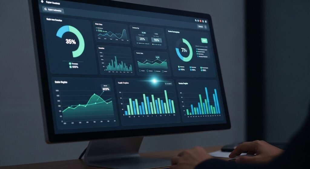
What Makes an Effective Cyber Audit Dashboard?
A cyber audit tool dashboard is the central interface where security professionals monitor vulnerabilities, track compliance status, and manage remediation workflows. An effective dashboard provides real-time visibility into critical security metrics through intuitive visualizations while minimizing cognitive load through logical information architecture and customizable views.
An effective security audit interface immediately surfaces the most critical information. According to industry data from Gartner, security teams spend up to 30% of their time navigating between different tools and dashboards. The most efficient platforms reduce this overhead through consolidated views.
The primary dashboard should display real-time risk scores and critical vulnerability counts within the first glance. Research shows that security analysts make faster decisions when high-priority alerts are visually distinct and accompanied by contextual data. Color coding, severity indicators, and spatial grouping of related metrics all contribute to faster threat assessment.
Compliance tracking represents another dashboard essential. Platforms like cyberaudit.online demonstrate how regulatory frameworks can be visually mapped to control implementations. Experts recommend dashboards that show compliance status across multiple standards simultaneously, as many organizations must adhere to PCI DSS, HIPAA, and GDPR concurrently.
How Do Leading Platforms Compare for Daily Use?
Daily usability separates adequate tools from exceptional ones. The standard approach involves evaluating how quickly teams can access needed functions without extensive training or reference materials.
Navigation efficiency varies significantly between platforms, with some requiring 3-4 clicks to reach common functions while others provide single-click access. Menu structures that follow security workflow patterns—from assessment to remediation to reporting—prove most effective. Logical categorization of features reduces search time and minimizes errors.
Data visualization quality directly impacts decision-making speed. Platforms with interactive charts, drill-down capabilities, and export-ready graphics enable faster reporting. Heat maps showing vulnerability distribution across network segments help prioritize remediation efforts. Timeline visualizations of security events aid in incident investigation.
Alert management systems represent a critical differentiator. Some platforms overwhelm users with identical alerts for related vulnerabilities, while others intelligently group issues by root cause. The most effective systems provide configurable alert thresholds and multiple notification channels based on severity levels.
How to Evaluate a Cyber Audit Dashboard in 5 Steps
- Assess the initial load time and whether critical metrics appear immediately without additional configuration.
- Test navigation to three common functions: vulnerability reports, compliance status, and user management.
- Evaluate data visualization clarity by interpreting charts without reading explanatory text.
- Check customization options for dashboard widgets, alert thresholds, and reporting templates.
- Verify integration capabilities with existing security tools and ticketing systems.
What Are Common Navigation Challenges?
Security professionals frequently encounter specific interface obstacles that hinder audit efficiency. Identifying these challenges helps organizations select tools that minimize friction.
Information overload remains the most reported dashboard complaint, with 67% of security teams citing excessive data points as their primary frustration. Effective platforms address this through tiered information presentation—showing summary metrics first with optional drill-down details. Context-sensitive help and tooltips further reduce cognitive load.
Inconsistent terminology creates confusion across different dashboard sections. Platforms that maintain standardized security terminology throughout their interface reduce training requirements. Clear labeling of compliance controls, vulnerability categories, and remediation statuses prevents misinterpretation.
Mobile responsiveness often receives inadequate attention in security tool design. Security incidents don’t respect office hours, making mobile access essential. Dashboards that maintain functionality on tablets and smartphones enable faster response times during off-hours. Touch-friendly interfaces with appropriately sized controls improve mobile usability.
| Platform Feature | Basic Tier | Professional Tier | Enterprise Tier |
|---|---|---|---|
| Custom Dashboard Widgets | Limited (3-5) | Moderate (10-15) | Unlimited |
| Real-time Compliance Tracking | Single Framework | 3 Frameworks | All Major Frameworks |
| API Integration Points | 5-10 | 15-25 | 50+ |
| Historical Data Retention | 90 days | 1 year | 7+ years |
| Collaboration Features | Basic comments | Workflow assignments | Full audit trail |
How to Customize Your Audit Dashboard
Customization transforms generic tools into tailored solutions. The most effective security platforms provide extensive personalization options without requiring technical expertise.
Role-based views represent the most valuable customization, displaying only relevant information for specific team members. Security analysts need vulnerability details, while executives require risk summaries and compliance status. Customizable dashboards reduce information noise and improve focus.
Widget configuration allows teams to prioritize their most-used functions. Drag-and-drop interfaces enable quick dashboard reorganization as priorities shift. Pre-built widget templates for common security scenarios accelerate initial setup. Saved dashboard layouts support different audit phases or incident types.
Alert customization prevents notification fatigue. Teams can define which events trigger alerts and through which channels. Escalation rules ensure critical issues receive immediate attention while lower-priority items follow standard workflows. Integration with communication platforms like Slack or Microsoft Teams streamlines alert management.
Future Trends in Security Dashboard Design
Dashboard evolution continues as security needs grow more complex. Emerging technologies and methodologies will shape next-generation interfaces.
Artificial intelligence integration will transform dashboards from passive displays to active assistants. Machine learning algorithms already help prioritize vulnerabilities based on exploit likelihood and business impact. Future dashboards will provide predictive analytics and automated remediation suggestions.
Natural language query capabilities will make data exploration more intuitive. Instead of navigating complex menus, security professionals will ask questions in plain language. Voice interfaces will enable hands-free dashboard interaction during incident response. These advancements will reduce the technical barrier to comprehensive security analysis.
Extended reality interfaces may eventually supplement traditional dashboards. Virtual reality environments could visualize network topology and threat propagation in three dimensions. Augmented reality overlays might display security status on physical infrastructure. While still emerging, these technologies promise more immersive security monitoring experiences.
Frequently Asked Questions
What is the most important feature in a cyber audit dashboard?
Real-time visibility into critical vulnerabilities tops the priority list. Security teams need immediate awareness of high-risk issues requiring urgent attention. Effective dashboards highlight these threats through visual prominence and severity indicators while providing quick access to remediation steps.
How much time can a good dashboard save security teams?
Approximately 5-10 hours weekly per team member according to cybersecurity efficiency studies. Well-designed interfaces reduce navigation time, accelerate report generation, and streamline alert management. This time savings allows security professionals to focus on strategic initiatives rather than administrative tasks.
Can audit dashboards integrate with existing security tools?
Most enterprise platforms offer extensive API integration capabilities. Leading solutions connect with vulnerability scanners, SIEM systems, ticketing platforms, and communication tools. Integration depth varies by vendor, with enterprise tiers typically offering the most comprehensive connectivity options.
What compliance frameworks do audit dashboards typically support?
Comprehensive platforms support PCI DSS, HIPAA, GDPR, ISO